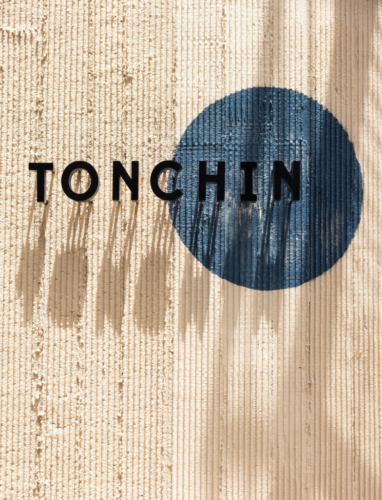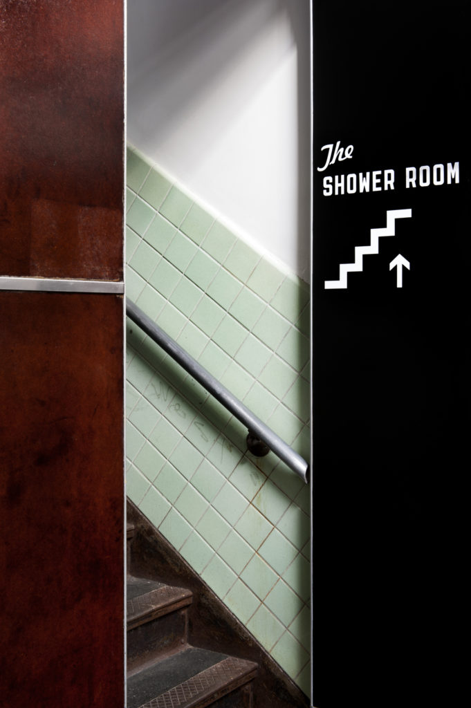
Tonchin
New York, NY
Tonchin, the acclaimed chain of ramen-focused restaurants originating in Tokyo, makes it's US debut with this stunner.
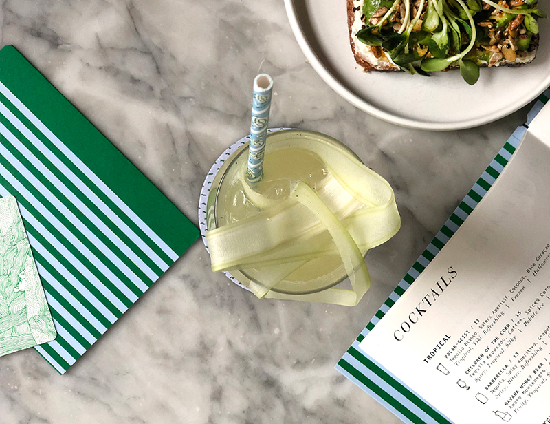
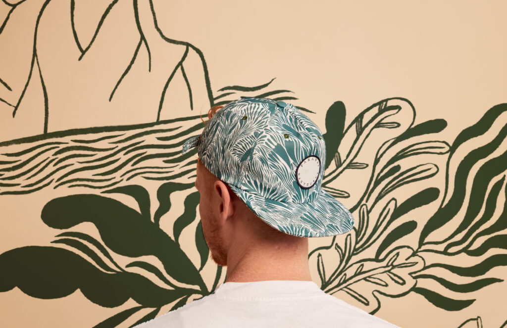
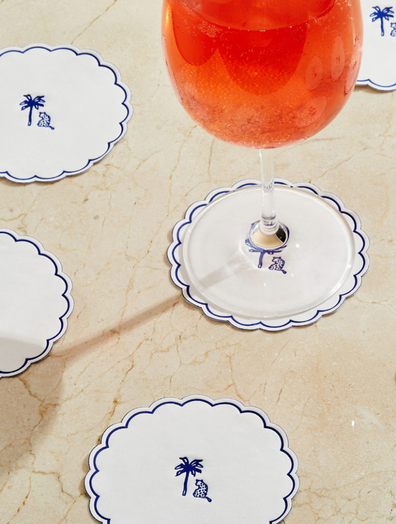
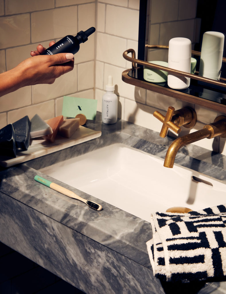
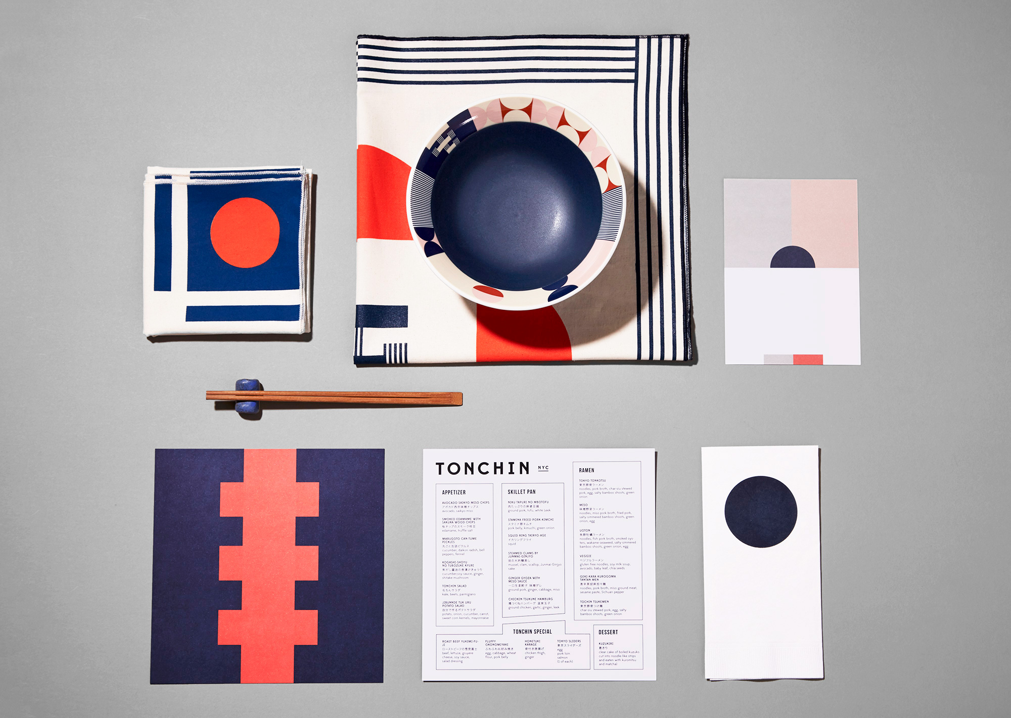
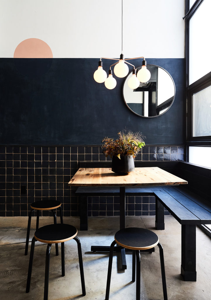
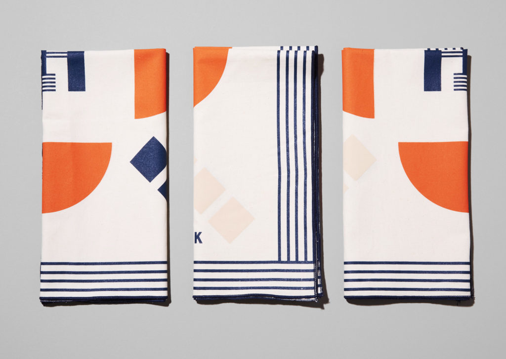
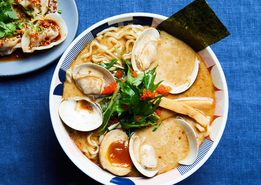
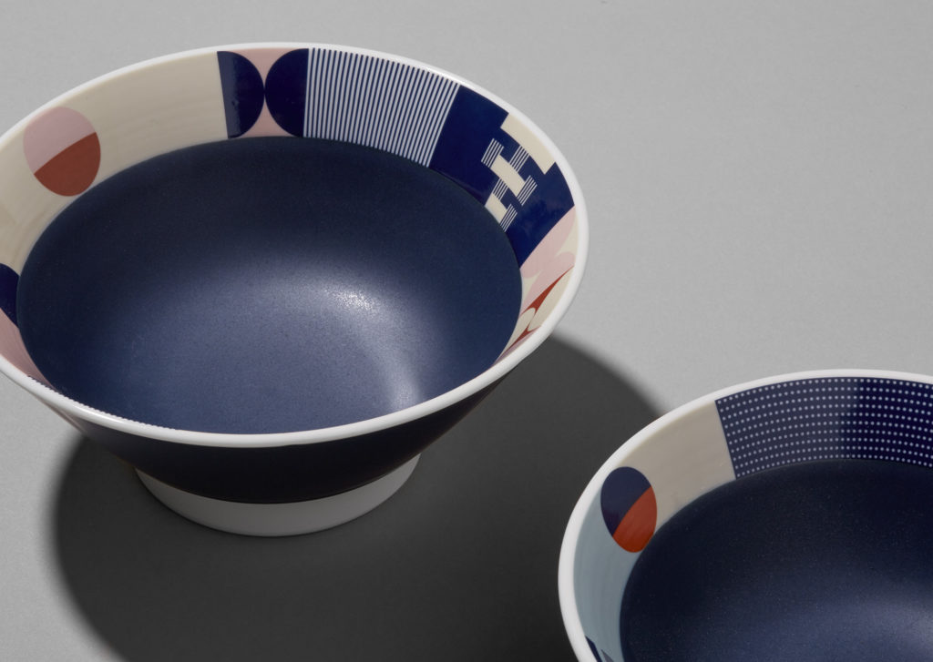
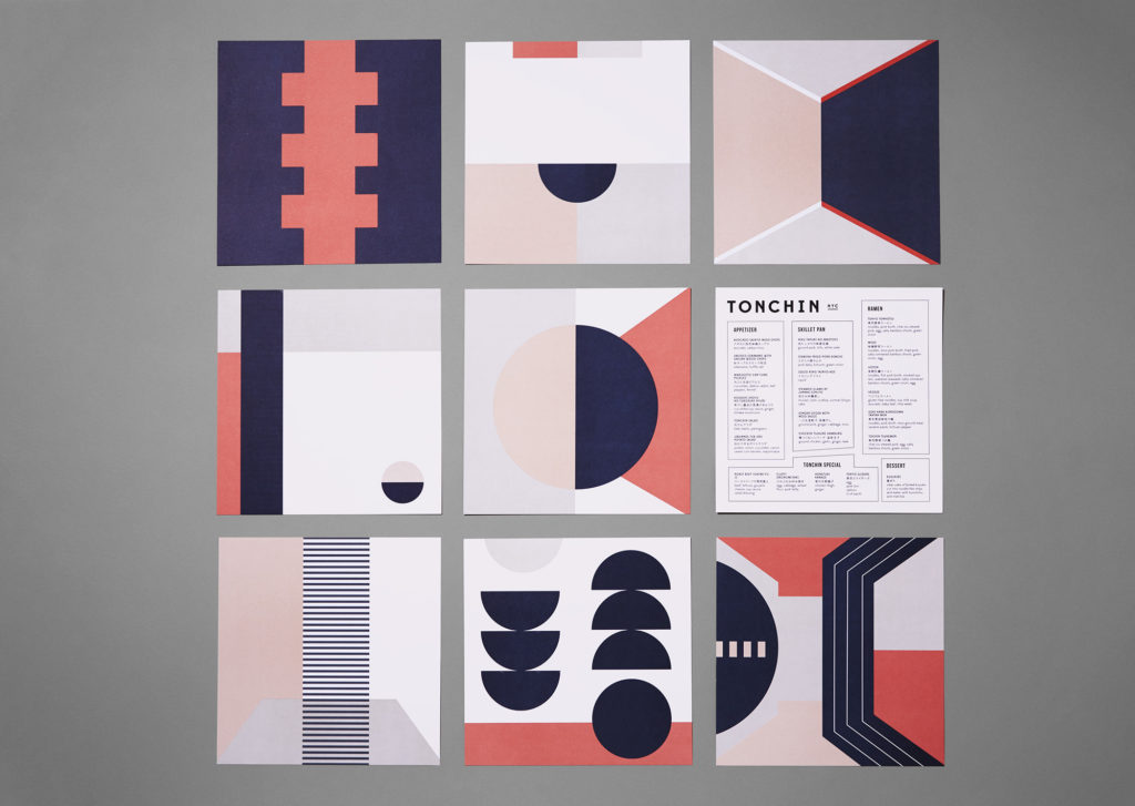
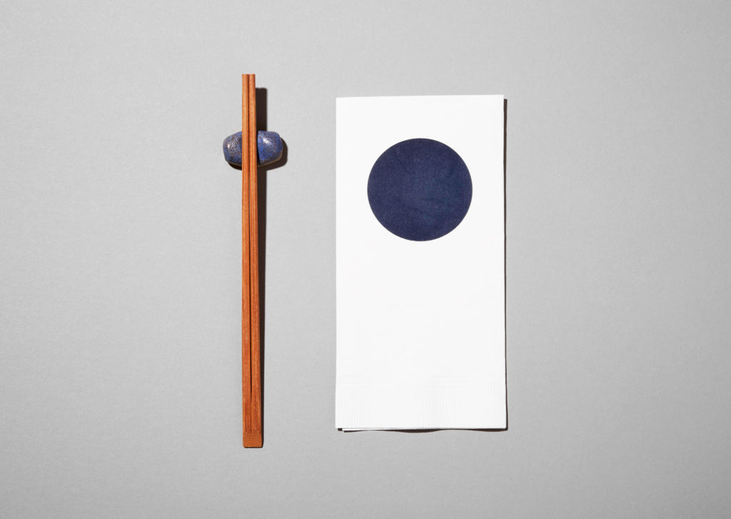
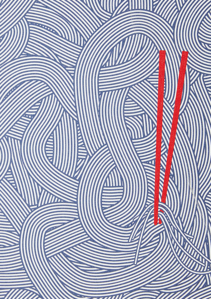
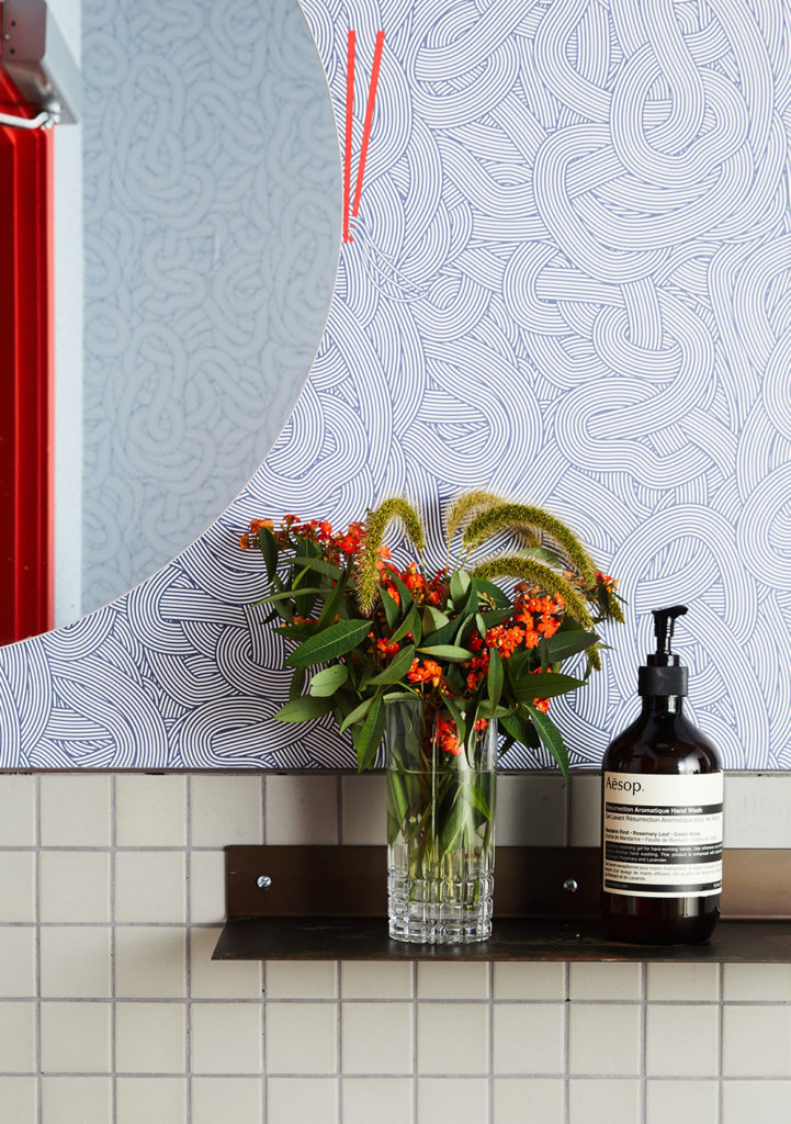
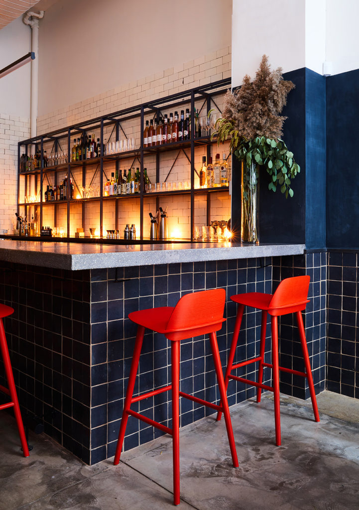
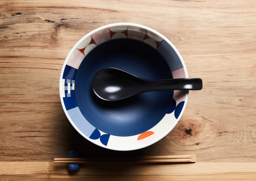
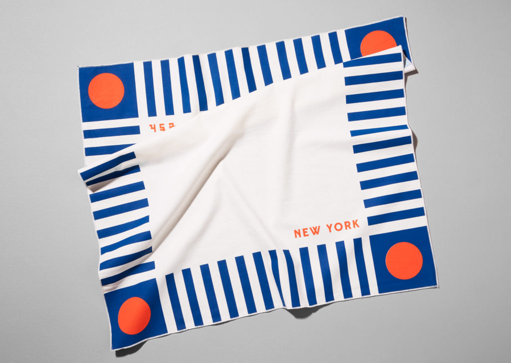
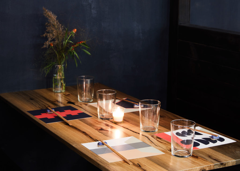
From the outset, the client wanted to design a brand that took inspiration from traditional Japanese design, but felt unmistakably New York. So, LMNOP created a totally new look and feel for their first location on this side of the globe. Bold, geometric graphics and patterns were used to create eight different menu backs, as well as to pattern the ramen bowls—custom-made in Japan—and scarves worn by the servers. The idea behind these patterns is that they can come together forming endless combinations, much like a bowl of ramen. These geometric shapes are also a nice contrast to some of the more organic textures in the space such as the ceramics light fixtures and chopstick holders (by artist Helen Levi) that sit on the menus. The branding also informed the graphics on the walls of the restaurant, which was designed by one of our favorites, Carpenter + Mason, whom we worked closely with from day one to ensure that the graphic and interior intentions were aligned.
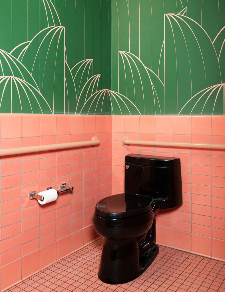
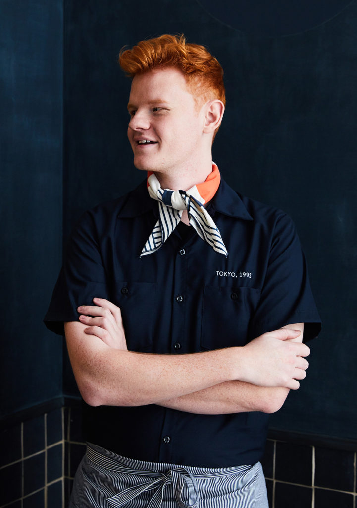
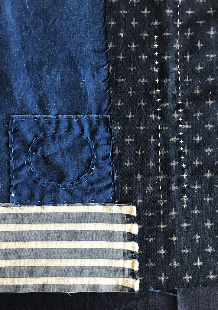
LMNOP also created custom uniforms—navy work coats, railroad denim striped aprons, Peel's work shirts, and colorful scarves. In an effort to honor Japanese craftsmanship, the team brought on textile artist Alison Charli Smith to transform one of our patterns into a hand-stitched noren hanging over the door to the kitchen, made from a combination of vintage Japanese textiles and hand-dyed linens, and woven together with intricate boro stitching. Last but not least,we designed a mural of swirling noodles was designed to cover the bathroom walls.
Interior and food photography by Nicole Franzin.
Services
- Art Direction
- Collateral Systems
- Identity Systems
- Menu Design
- Photography
- Signage + Wayfinding
- Uniforms
- Wallpaper + Murals

- All
- Animation
- Apparel + Merchandise
- Art Direction
- Brand Architecture
- Brand Identity
- Brand Narrative
- brand strategy
- Collateral Systems
- Content Creation
- content strategy
- Copywriting
- creative direction
- development liaison
- E-Commerce
- Editorial
- Identity Systems
- Illustration
- integration support
- Menu Design
- Naming
- Packaging
- Photography
- Signage + Wayfinding
- Social Media
- Trends Trek
- UI / UX Design
- Uniforms
- Video
- Wallpaper + Murals
- Web Design