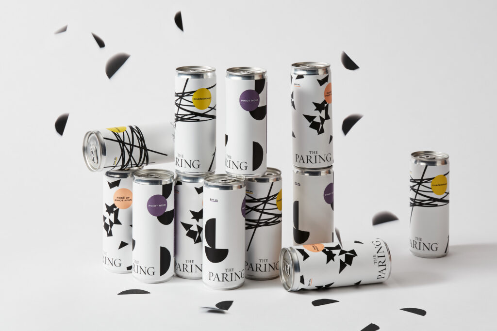
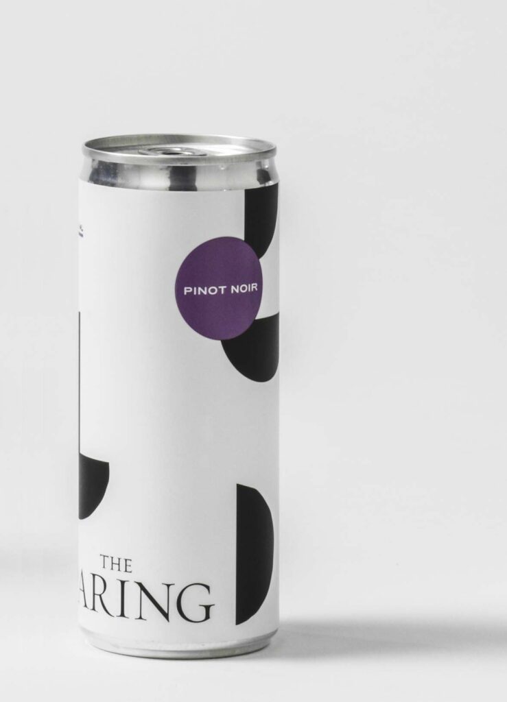
The Paring
Sta. Rita Hills, CA
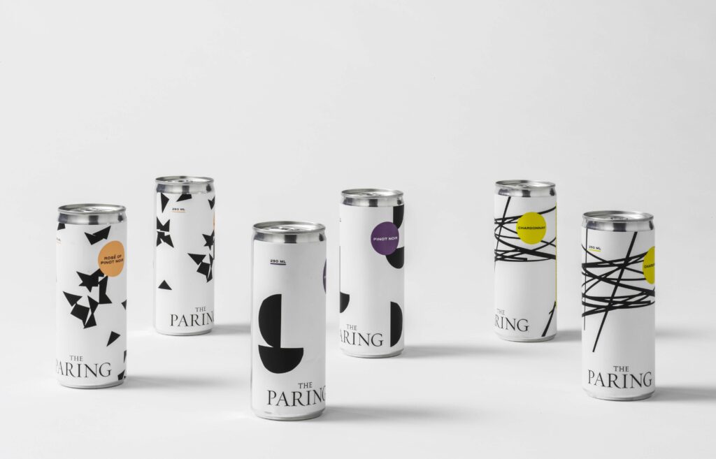
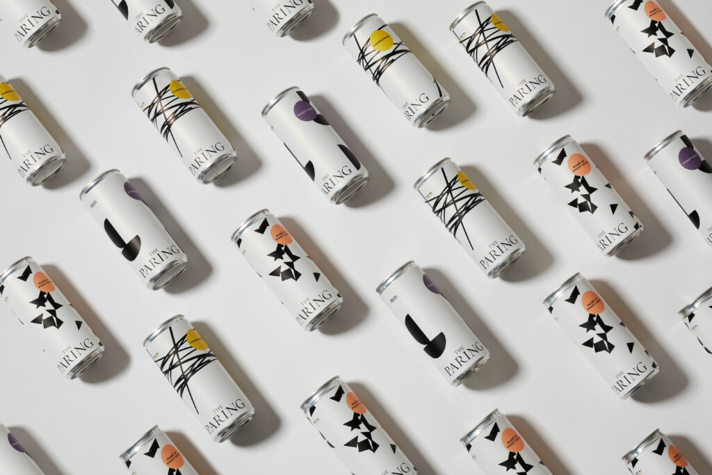
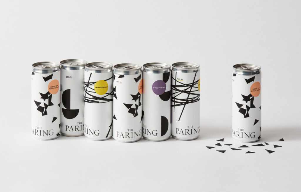
The Paring, a play on words, refers to the pairing of new and old vines for these distinctive wines.
When The Paring let us know they were launching canned wine for a younger audience, we played off this same juxtaposition with the design. Keeping the crisp logo and black-and-white color story, we added dynamic graphics and hits of bold color. Cut paper geometric shapes were scattered, photographed, and then tweaked digitally to create compositions that feel fresh and spontaneous, much like the spirit of the wine itself.
Services
- Brand Identity
- Illustration
- Packaging


Sort
- All
- Animation
- Apparel + Merchandise
- Art Direction
- Brand Architecture
- Brand Identity
- Brand Narrative
- brand strategy
- Collateral Systems
- Content Creation
- content strategy
- Copywriting
- creative direction
- development liaison
- E-Commerce
- Editorial
- Identity Systems
- Illustration
- integration support
- Menu Design
- Naming
- Packaging
- Photography
- Signage + Wayfinding
- Social Media
- Trends Trek
- UI / UX Design
- Uniforms
- Video
- Wallpaper + Murals
- Web Design