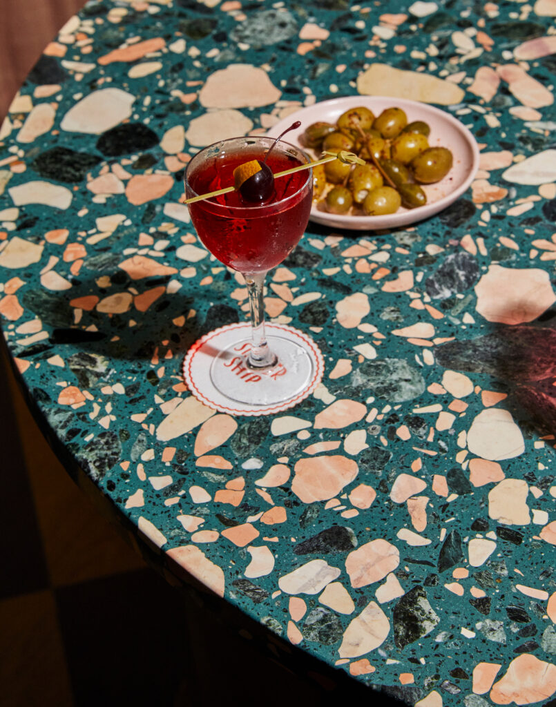
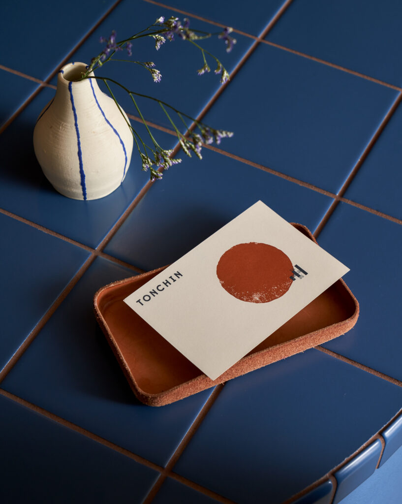
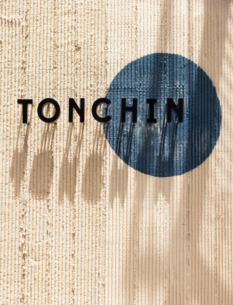
Tonchin Brooklyn
Brooklyn, New York
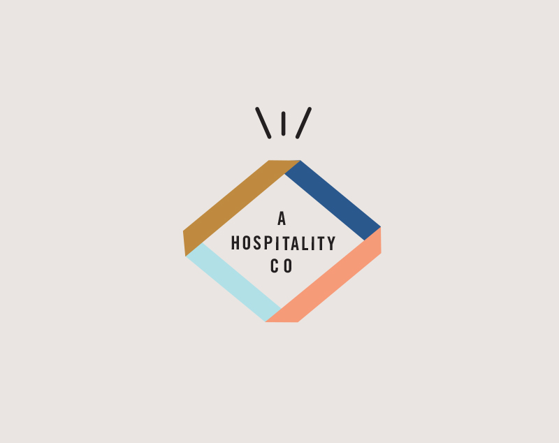
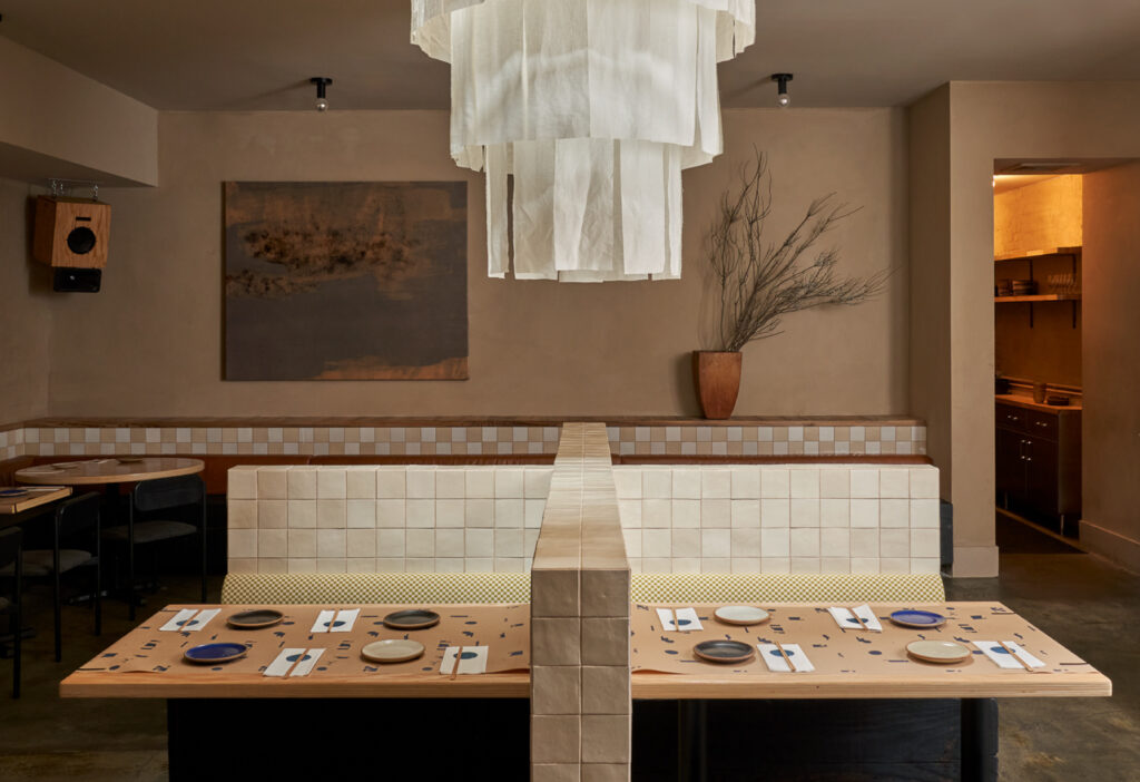
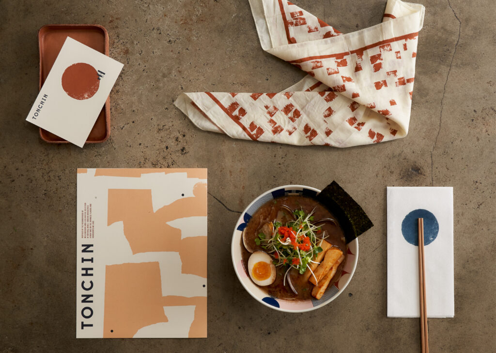
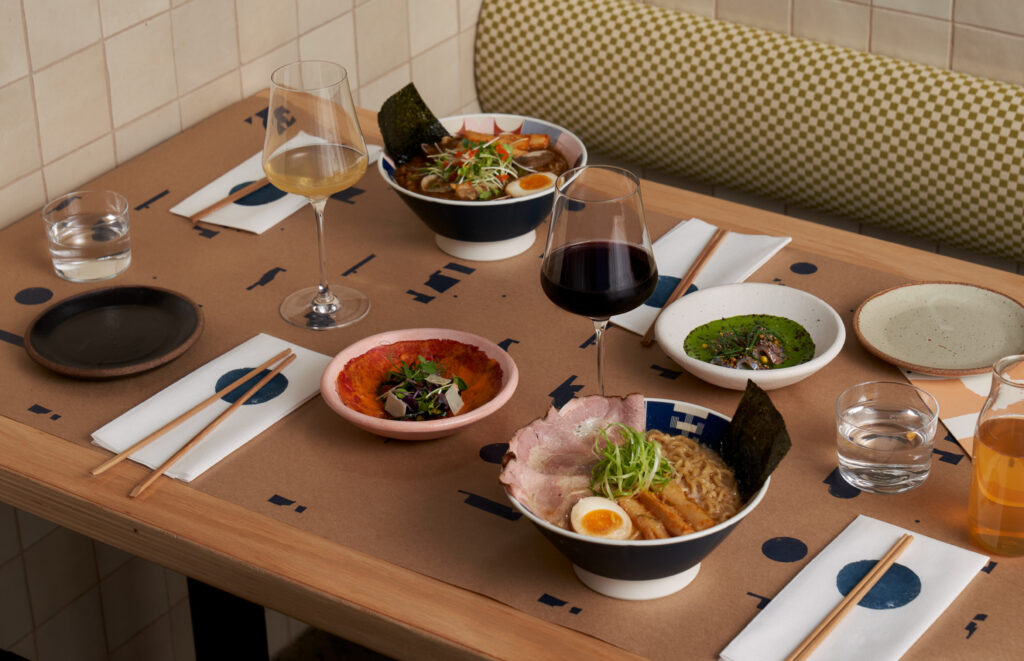
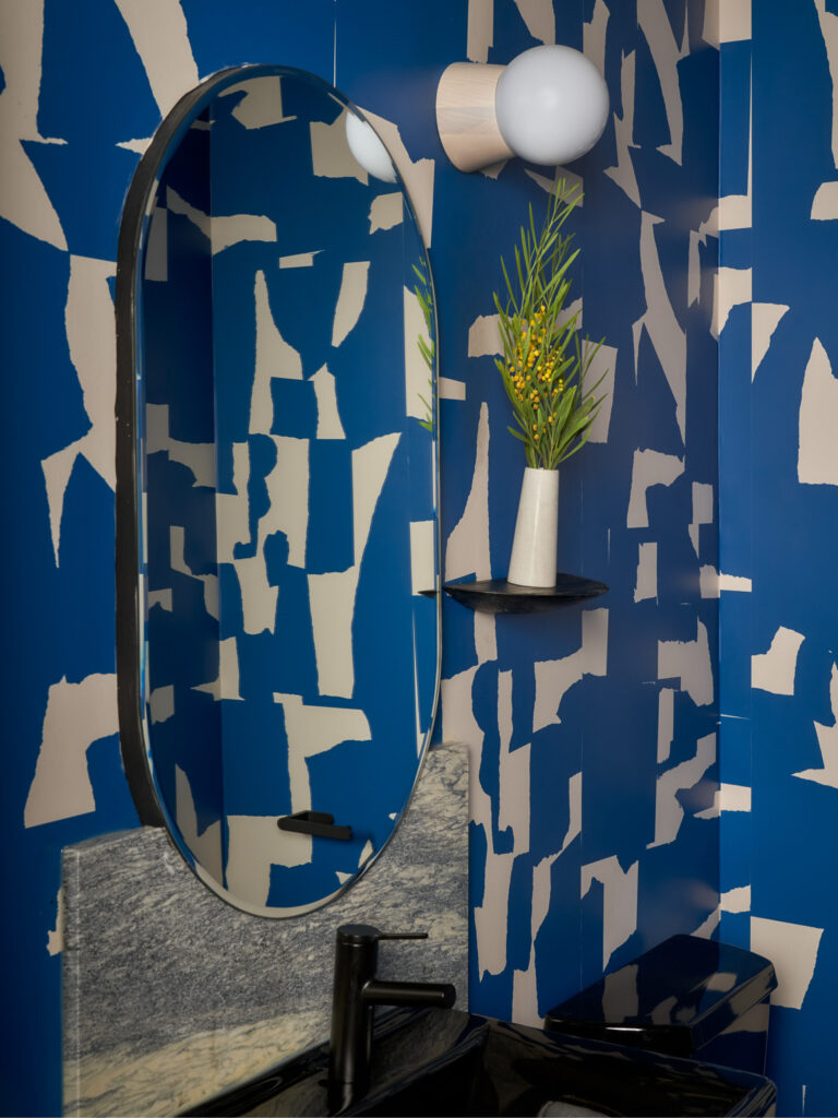
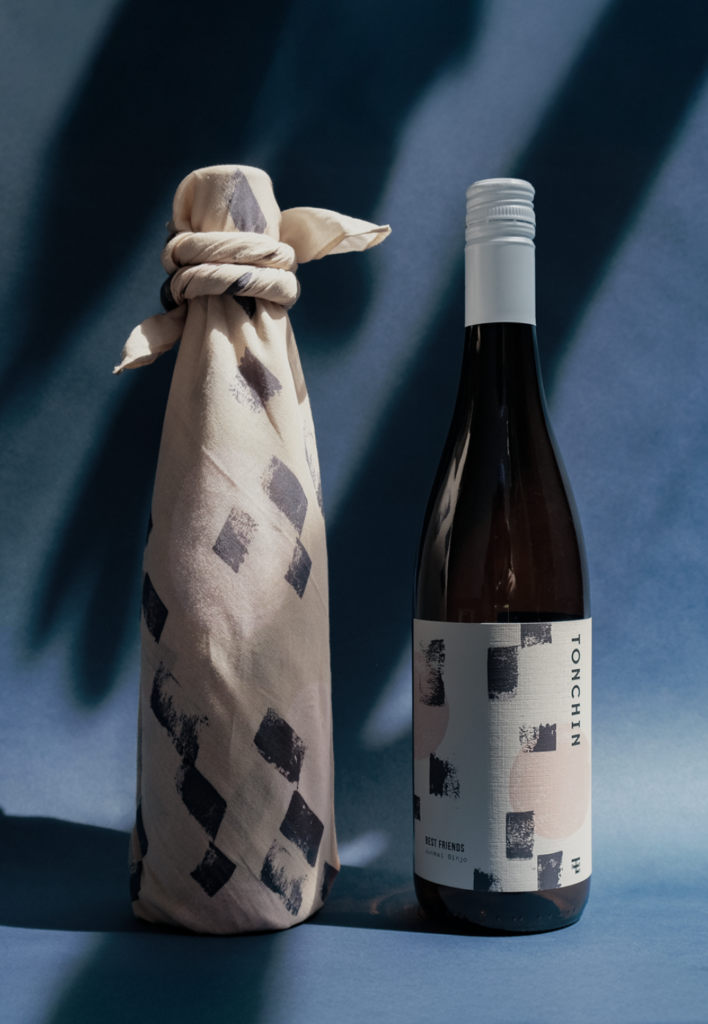
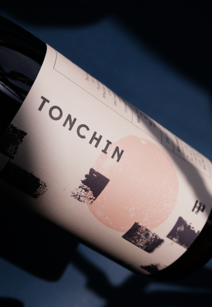
With the mad success of Tonchin, New York, there was an opportunity to take a tasteful twist to the brand's equity LMNOP designed, determining what unique signifiers define Tonchin as they grow globally. Building principles visually and verbally for the brand to unify and differentiate, all while preserving the overall brand integrity and mission.
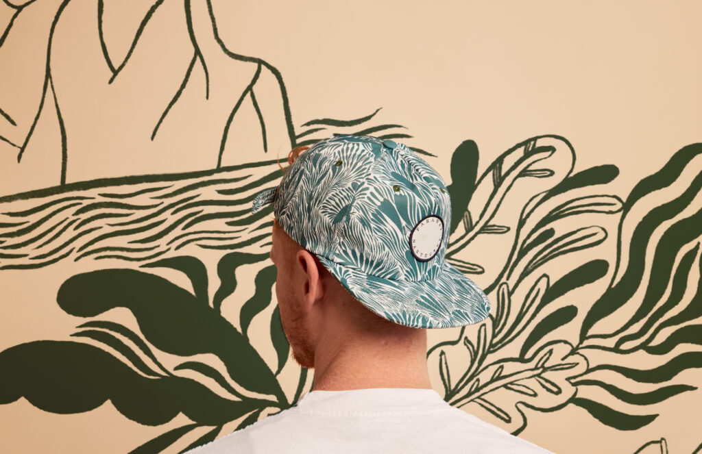
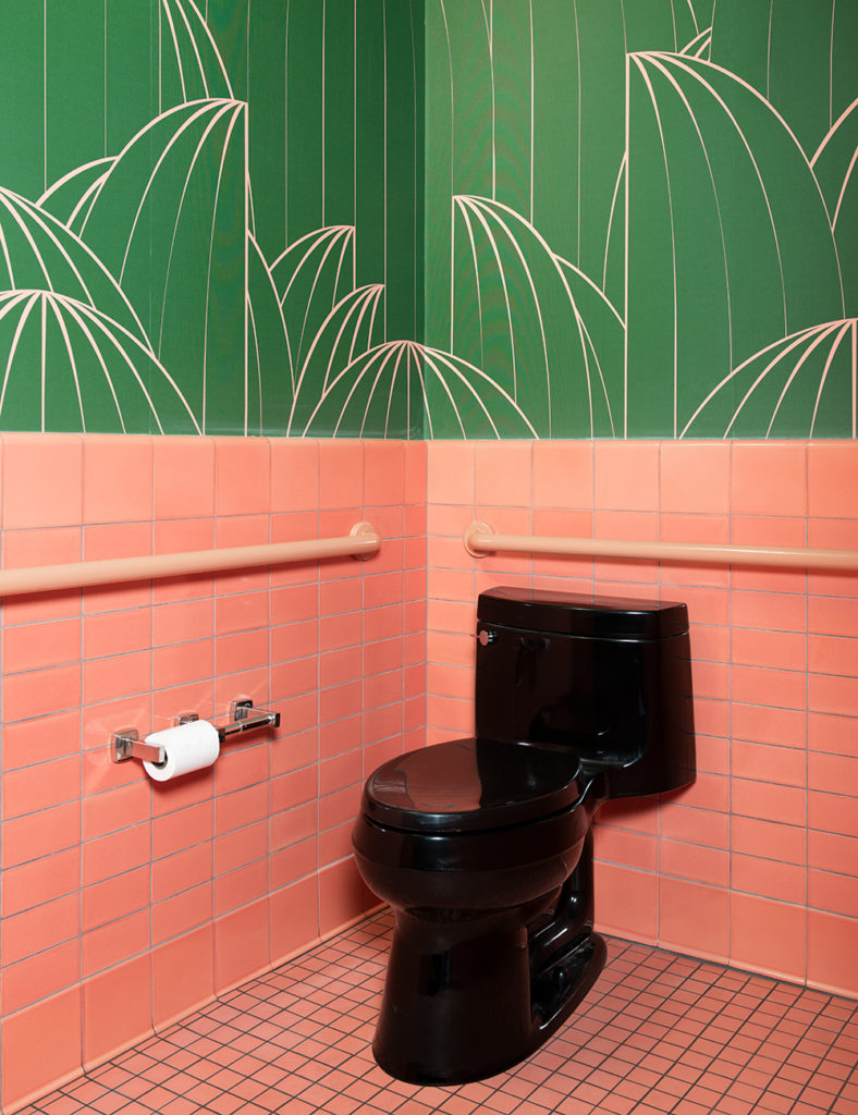
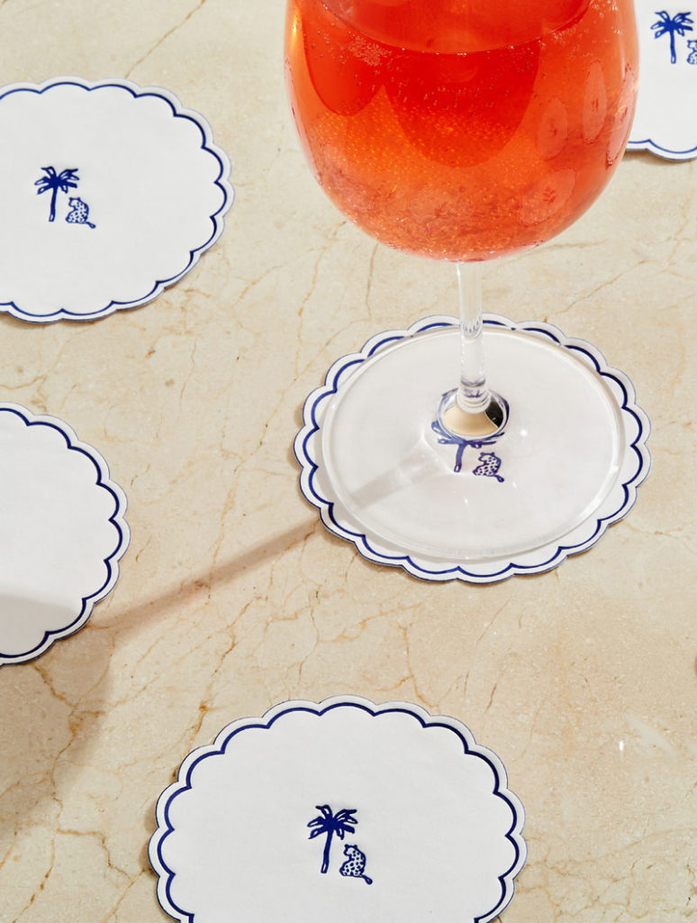
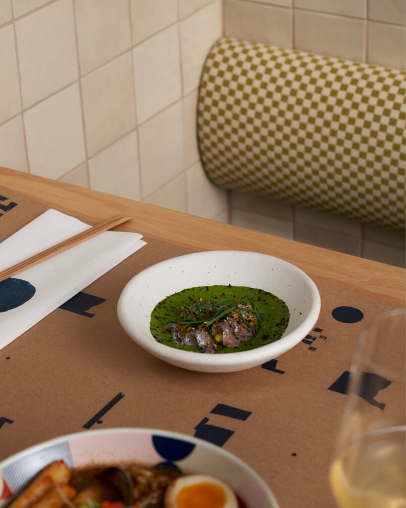
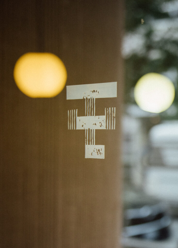
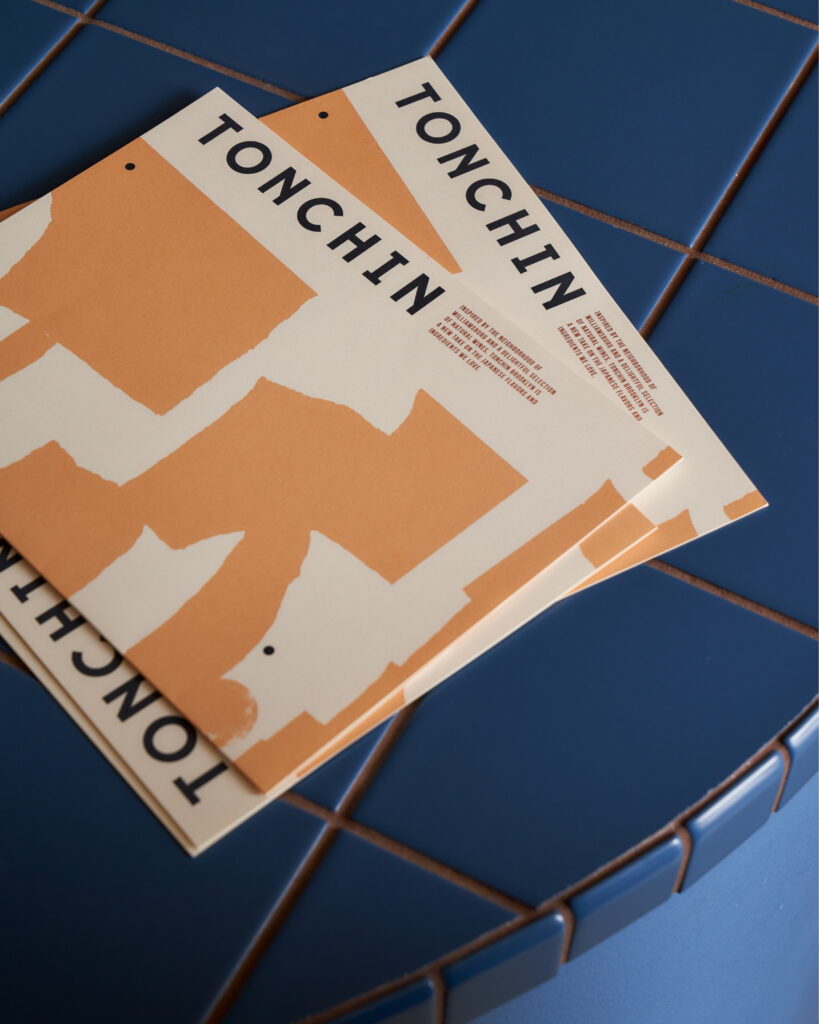
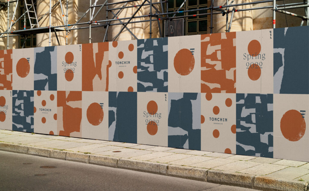
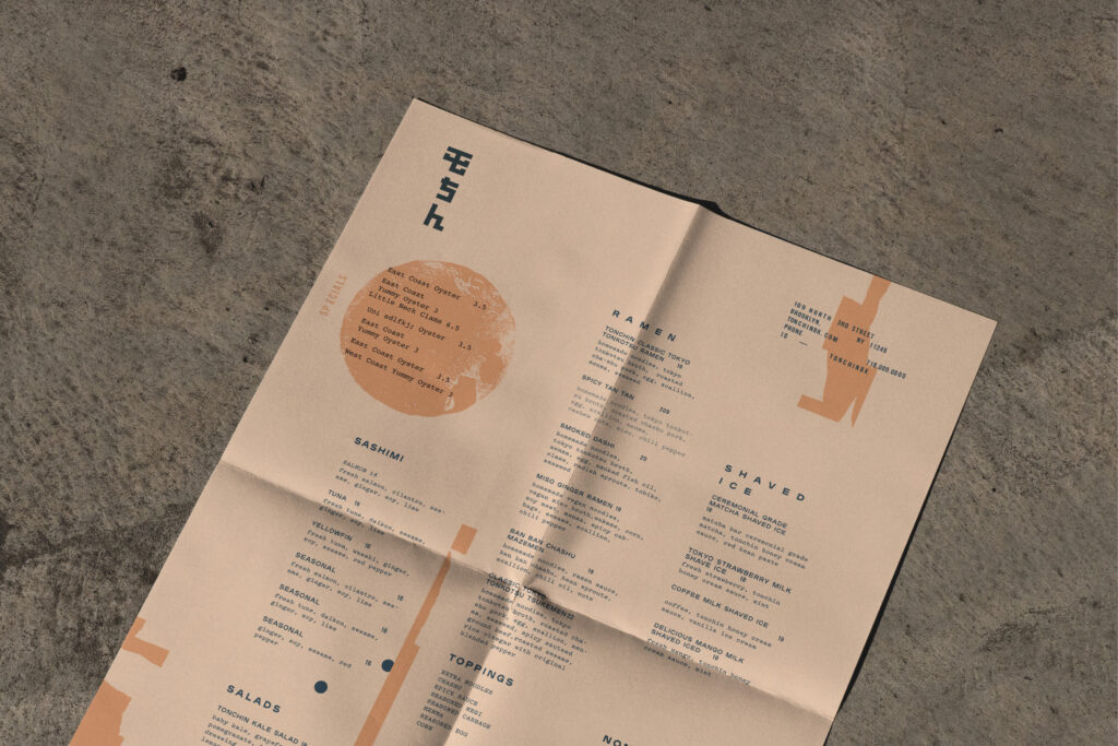
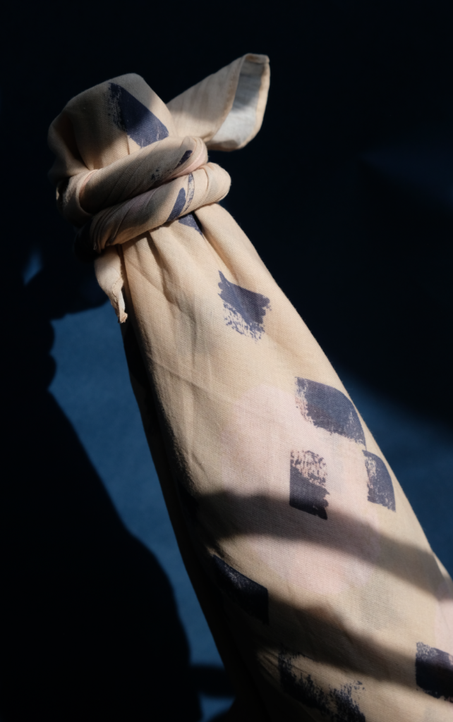
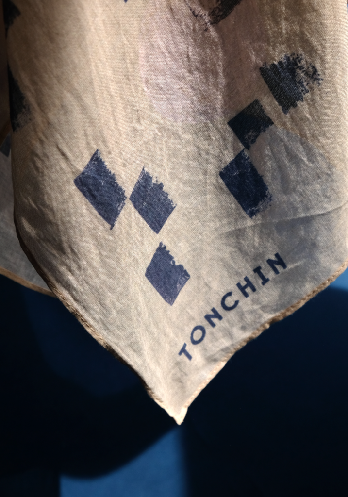
Bold, geometric graphics and patterns were used to create the parent brand; the idea behind these patterns was to come together, forming endless combinations, much like a bowl of ramen. Leveraging this graphic strategy, we varied the pattern style, secondary color palettes, and logo lock-ups to be unapologetically experimental and embrace the perfectly imperfect expression of Brooklyn.
Stay tuned as more locations and graphics are coming!
Services
- Art Direction
- Brand Architecture
- Collateral Systems
- Identity Systems
- Signage + Wayfinding
- Uniforms
- Wallpaper + Murals
Collaborators


- All
- Animation
- Apparel + Merchandise
- Art Direction
- Brand Architecture
- Brand Identity
- Brand Narrative
- brand strategy
- Collateral Systems
- Content Creation
- content strategy
- Copywriting
- creative direction
- development liaison
- E-Commerce
- Editorial
- Identity Systems
- Illustration
- integration support
- Menu Design
- Naming
- Packaging
- Photography
- Signage + Wayfinding
- Social Media
- Trends Trek
- UI / UX Design
- Uniforms
- Video
- Wallpaper + Murals
- Web Design